Drawing an eye diagram with Python
Drawing an eye diagram with Python
I just got a task for university…well, lets say it was a bunch of tasks but this one was kinda heavy for me at first.
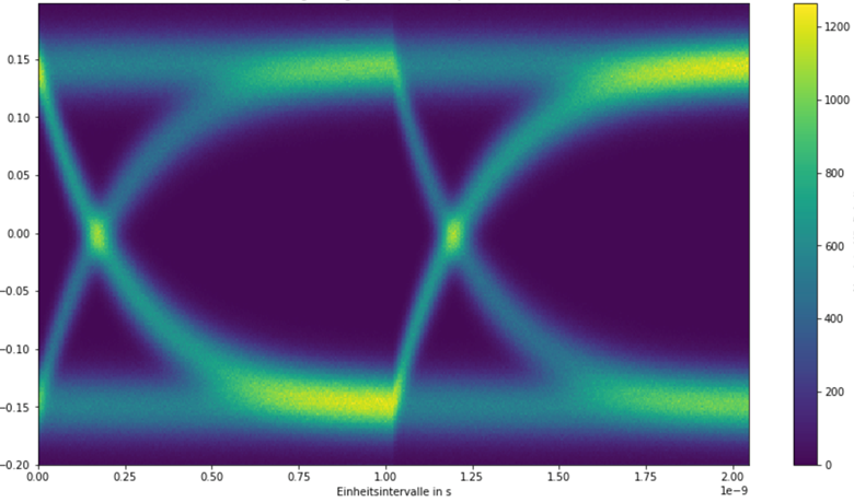
Imagine getting a dataset consisting of millions of values resulting from just measuring the Voltage of a USB transition for a couple of seconds. The task was to analyse those values and draw the results into a so called eye diagram to see how distinctive the symbols aka ON / OFF levels are.
After hours upon hours of trying to find ways I finally came up with a solution.
import numpy as np
from matplotlib import pyplot as plt
from numpy import matlib as ml

# some definitions for the usecase.
sps = 256 # samples per symbol
V = ... # array with the samples
dt = 4e-12
nsymbols = len(V) / sps # number of symbols
UI = sps * dt # unit interval in seconds
# place 2 symbols on the graph so the transmission is noticeable
sympslide = 2
# number of repeats stacked in the histogram
repeats = nsymbols // sympslide

# prepare x axis, thats the interesting part !
x = np.linspace(0, UI * sympslide, (sps * sympslide))
# most important step imho. basically mapping the values array after the
# needed amount of slides / repeats
# this way two (or the required number of symbols per slides) get added on top of
# each other to generate the heat map
# for the eye diagram, needed to "fill" the histogram
x = ml.repmat(a=x, m=repeats,n=1).flatten()

fig, ax = plt.subplots(figsize=(15,8))
h, xedges, yedges, image = ax.hist2d(x, V, bins=[sps * sympslide, sps])
pp.colorbar(image)
At first I’m defining some variables after the data regarding the amount of samples one Symbol consists of, the sample-rate etc. followed by how many symbols should be overlapped for the histogram. By overlapping two symbols you can create an actual eye for the eye diagram since it needs the full transition from one to another symbol.
The hardest part was finding a solution how to overlap the signal…like how to put each Symbol pair on top of each other to display the possible outcomes over time and generate a heat map. After tinkering for hours and talking to some colleagues we came up with the idea of repeated matrices on the basis of the given spectrum and later flattening those matrices so the individual points add up in the histogram.
Later those flattened matrices can be displayed in a two-dimensional histogram generating a heat map and showing the phase spread. The benefit of the generated eye diagram is to be able to determine on when to sample the actual binary data.
“When the eye is most open” in the best case :p
For this you’ll have to check for intersections of the transitions and get the mean value of both positions. This results in the timestamp per unit interval with the best sample position.